Infographics are nice. But only if they inform.
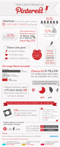
Yesterday I came across this infographic from Wishpond via ethority:
I scanned it and was close to hitting the “Pin it” bookmarklet because you never know, might come in handy one day, when the questions popped up.
Why are there two figures for average time on Pinterest? Oh, American and overall users.
Pinterest referrals spend 70% more money than visitors referred from non-social channels. That seems like a lot… Oh, NON-SOCIAL – so this is not in comparison with Facebook but other sites.
The average Pinterest user spends 98 minutes on the site, the Facebook user 7 hrs. Per what? Day? Not likely. Week? Month? So I used the “Live Help Line” button on Wishpond’s site and got an answer. Per month. That seemed low. Then he gave me the source: A media bistro infographic from February 2012 (look at the URL). Seriously?
Sorry to be complaining but that’s not how infographics work and while I am at it: Please put a date stamp on them, everybody.
