Dear Foursquare, you are idling a bit. Please fix these bugs!
I love location-based game/service/juggernaut, that’s no secret. I can’ even put my finger on “why”, I guess it’s part of tracking my life (for a detailed intro into tracking look at the ‘Quantified-Self Series‘ from Third Wave). However, there are a couple of things that really bug me. A lot. For a company that has raised $71m they should move the needle quicker. Much quicker.
In no particular order:
1. Fix the UI for checking in! Imagine I visit the atm and the bakery and the drycleaners. That trip will take me 5 minutes and I want to check in quickly. I do not want to share the place with my friends. Just checki-in. So why is it, that after I hit check-in and hit “back” I get to the friends view, not the list of place offered to check-in? I know it’s a social software but to me that user route is flawed.
2. Fix the algorithm for determining which places to present when I hit “Check-in”. I don’t understand that the place that is only 1meter away and which I have been to before is buried three scrolls down so that more popular places that are 200 meters away can be listed. so annoying. If you use the GPS then let the GPS have a higher importance in the algorithm.
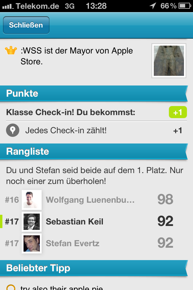
3. Fix the damn translation. We’re not both in 1st place. We’re tied in one place. “<user1> und <you> seid jetzt gleichauf. Nur noch ein Punkt zum überholen!”

4. Timing. Unless it’s a restaurant “two hours ago” isn’t really helpful. There’s always this tiny bit of excitement when I see that another Foursquare user is at the venue I am checking in, only to be dissapointed because that person was there so long ago.